NaughtyPE Logo
#1
Posted 25 July 2009 - 03:33 PM
Anyone having a hand for things like that?
My initial idea can be seen here.
White background with a thin black border to give it the impression of a seal.
The PE in a NaughtyPE like blue and the actual name in black.
Readability was poor imo, so i exchannged the blue for a brighter color.
Readability was improved, but still not good. Besides i didn't like the red. So my next idea was this.
The name sticks out great now, but the PE melts too much into the background.
So red again!
So now i have a logo which is easily readable, but sucks design wise imo.
Any help would be appreciated.
#2
Posted 25 July 2009 - 04:07 PM
#3
Posted 25 July 2009 - 04:21 PM
The tail unfortunately disappears mostly.
What program did you use to whipt that up so fast?
#5
Posted 25 July 2009 - 04:56 PM
Here's the original image:
http://ruffruffandme...Doggie_Bandanas
When I find an image with an interesting format, it's usually a fast process to adapt as needed.
While googling, here's another candidate:
GIMP is handy to work with once you get around more familiar with the available tools.
btw: #4 is looking good but don't forget to make the background transparent to look better whenever the image is placed under other contexts. Too bad the PE part is not in uppercase, maybe there's a similar font to achieve this.
#6
Posted 25 July 2009 - 06:01 PM
That's a way to do it too. Great solution to the problem.I used google image search and GIMP.
#7
Posted 25 July 2009 - 06:17 PM
Though of course these type of "themes" may confuse with FreeBSD logos:
Where is The Hive?
He is the man for this job!
jaclaz
#9
Posted 25 July 2009 - 06:42 PM
MedEvil: I like the first logo in black, perhaps a bit better than the red/blue color combination.
#10
Posted 25 July 2009 - 06:47 PM
Some semi-random results I personally like (in order to get some ideas):
Wer klaut meine Teufel?
Joshua
#11
Posted 25 July 2009 - 06:58 PM
Wer klaut meine Teufel?
Joshua
Sie brauchen mehr Aufmerksamkeit beim Lesen:
Though of course these type of "themes" may confuse with FreeBSD logos:
jaclaz
#12
Posted 25 July 2009 - 07:10 PM
Yes, the red-blue ones were just tests, no chance those will ever end up to be used.MedEvil: I like the first logo in black, perhaps a bit better than the red/blue color combination.
The black one does look kinda nice, but i think it looks to plain when used in the NaughtyPE script.project.
At the moment those 3 are my favorites.
#13
Posted 25 July 2009 - 10:51 PM
Would help to choose.
#16
Posted 26 July 2009 - 12:38 AM
But change the red to a more bright devlish intensity.
#17
Posted 26 July 2009 - 12:52 AM
Red, really?I would still go for the red letters like this:
I turned away from it, because i thought, it didn't really go with the blueish screenshot.
Sort of the same problem, i had with the yellow smiley.
The red used in the logos is still the original one from your pictures. I didn't change it.But change the red to a more bright devlish intensity.
#18
Posted 26 July 2009 - 01:26 AM
Now it's the "PE" that would probably also look better filled in red as well.
But I agree with you. Red looks good on the logo but doesn't go very well with your project blue oriented theme.
Solution - change the project theme..
To help you get started, here goes a suggestion for the new project wallpaper as a sort of honor to the memory of MJ:
#19
Posted 26 July 2009 - 11:35 AM
Changing the NaughtyPE wallpaper is no easy feat. And i've gotta know, because i've tryed.
I had some time ago the idea of creating NaughtyPE flavours.
A classic one with blue theme, one especialy meant for old comuters (min. Pentium100Mhz, 48MB RAM) with a green theme and one with a red theme which was suppose to need a full CD and something more recent in the range of min. 2GHz, 512MB.
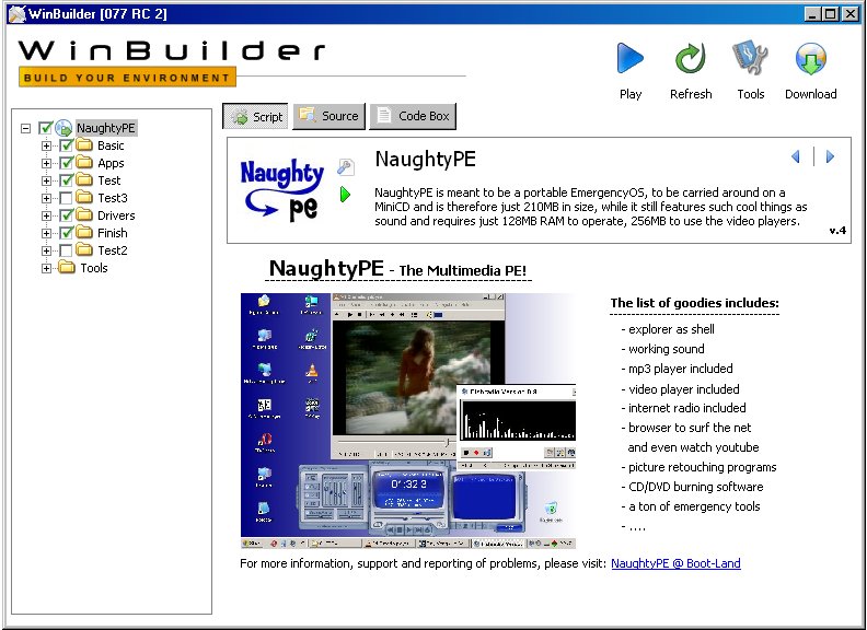
The NPE wallpaper is a special one, unlike any used in other PE.
It is only 62 Byte big, yet looks equaly great on alll resolutions, without ever showing any stairstepping no matter how big the chosen screen resolution is.
Yep, that's no typo, Byte!!! Makes room for a whole lot of other things.
Exchanging the blue for an equaly dark red or even worst green, will not result in a wallpaper, which looks the same except for a different base colour.
With a red - and even worst with a green base color, the wallpaper looks mostly white with a light colour edge on the left.
Has something to do with the way humans percieve colours, i guess, cause from the point of view of the computer, there is no such difference between them.
If you like, you can give it a try
#20
Posted 26 July 2009 - 04:16 PM
#21
Posted 26 July 2009 - 04:36 PM
#22
Posted 27 July 2009 - 11:43 AM
As usual, eyecandy changes don't get a a script around here a new version number.
If you want to have the new file, delete script.project in your NaughtyPE and download the new one.
#23
Posted 22 August 2009 - 04:42 PM
You guys came up with some good stuff. I like the naughty tale.
Looking at the screenshots with WInbuilder the blue seems to fit and be more readable.
#24
Posted 02 September 2009 - 08:18 AM
OR
#25
Posted 06 September 2009 - 10:19 PM
0 user(s) are reading this topic
0 members, 0 guests, 0 anonymous users